“`html
How to Effectively Find the Interquartile Range: A Smart Guide for 2025
The interquartile range (IQR) is an essential statistical tool used to measure the spread of data. Understanding how to find the IQR is critical for analyzing data sets and interpreting significant variations in statistics. In this guide, we’ll uncover the steps to calculate the interquartile range, delve into its real-world applications, and highlight its importance in data analysis for 2025.
Understanding the Interquartile Range
The IQR represents the range of the middle 50% of a data set, providing insight into the central tendency while robustly reducing the impact of outliers. It is essential to comprehend the concepts of quartiles, as they allow us to segment data into four equal parts. The first quartile (Q1) and third quartile (Q3) mark the 25th and 75th percentiles, respectively, serving as a crucial foundation for understanding the interquartile range.
What Are Quartiles?
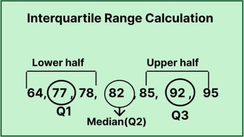
Quartiles split a ranked data set into four equal segments. This helps in describing the variability in data succinctly. The second quartile (Q2) is the median, dividing the data into halves. To calculate quartiles, you need to first sort the data from least to greatest. The first quartile (Q1) represents the median of the first half, while the third quartile (Q3) represents the median of the second half. Thus, Q1 and Q3 allow you to compute the IQR effectively.
Steps to Calculate the Interquartile Range
To calculate the interquartile range, follow these structured steps:
- Organize the data in ascending order.
- Determine Q1, which is the median of the first half of your data set.
- Determine Q3, which is the median of the second half of your data set.
- Subtract Q1 from Q3 to find the IQR using the formula: IQR = Q3 – Q1.
This method allows for a practical understanding of the range of middle 50% of data and highlights any outlier detection approaches necessary for accurate data analysis.
Visualizing Quartiles Through Box Plots
Box plots, also known as box-and-whisker plots, are an effective way to visualize the interquartile range and help depict the distribution of data. They provide a graphical representation of the median, quartiles, and potential outliers within your data set. This representation illustrates how the IQR measures the spread of data variability, making it easier for one to interpret data.
Constructing a Box Plot
To construct a box plot:
- Calculate the quartiles as previously mentioned.
- Draw a box from Q1 to Q3, marking the median within the box.
- Extend the “whiskers” to represent the minimum and maximum values within 1.5 times the IQR.
- Any data outside this range will plot as individual points, offering visual cues for outlier detection.
This visual guide of data distribution enhances your understanding of how values populate across the axis and contributes to effective data analysis techniques.
Interpreting the Box Plot
When interpreting a box plot, pay attention to the shape and size of the box, as well as the length of the whiskers. A small IQR indicates that the data points are clustered closely around the median, while a large IQR signifies greater data dispersion. This clear visualization can aid in understanding variability in data and support your overall statistical analysis.
Practical Applications and Importance of the Interquartile Range
The interquartile range not only plays a fundamental role in statistics coursework but also has practical applications across various fields. It is widely utilized in finance to assess the spread of asset returns, in quality control to identify variability in manufacturing processes, and in academic research to summarize key statistics effectively.
Real-World Applications of IQR
In finance, the IQR is beneficial for understanding the potential risks and returns of investments. For instance, an investor reviewing the IQR of stock returns can gauge price volatility and adjust their portfolio strategy accordingly. Understanding the implications of the IQR can thus foster informed decision-making and strategy optimization.
The Importance of the Interquartile Range in Data Science
In the realm of data science, the IQR is essential for crafting robust statistical models. It helps analysts disseminate valuable insights and visualize the spread of data, thus supporting the advancement of statistical techniques. Systems utilizing IQR for data exploration become particularly potent when handling datasets plagued with outliers—offering a resilient measure of data dispersion.
Key Takeaways
- Understand and calculate quartiles for effective data analysis.
- Utilize the formula for IQR: IQR = Q3 – Q1 to interpret spread.
- Visualize quartiles and the IQR through box plots for comprehensive data analysis.
- Recognize the relevance of IQR in real-world applications across various sectors.
- Leverage insights from IQR for informed decision-making and statistical modeling.
FAQ
1. What is the interquartile range and why is it important?
The interquartile range (IQR) is a measure of statistical dispersion that shows the range of the middle 50% of a data set. It’s crucial for understanding variability, as it provides insight into the spread of data while mitigating the effects of outliers.
2. How do you interpret the IQR in a data set?
Interpreting the IQR involves examining the distance between Q1 and Q3. A larger IQR indicates wider data spread, while a smaller IQR implies the data points are closer to the median, suggesting lower variability in your data set.
3. How does the IQR help in outlier detection?
The IQR aids in outlier detection by defining bounds. Values falling below Q1 – 1.5 * IQR or above Q3 + 1.5 * IQR are typically considered potential outliers, providing a robust mechanism to analyze data spread methods.
4. What are some common misinterpretations of IQR?
One common misinterpretation is confusing the IQR with the overall range of data. Unlike the overall range, which includes all data points from the minimum to maximum, the IQR specifically focuses on the central part of the distribution, offering insights into data stability.
5. Can the IQR be used with skewed distributions?
Yes, one of the strengths of the IQR is its robustness against skewed distributions. It provides a realistic view of data variability without being unduly influenced by extreme values compared to methods like standard deviation.
“`